By: 100WIND |
Typography has always been an essential part of graphic design, particularly when it comes to branding. The use of typography can have a significant impact on a brand's identity and recognition, even sometimes evoking specific emotions in consumers. This blog post will explore how typography has been used by some of the world's most well-known brands and how it has propelled them too success.
COCA COLA


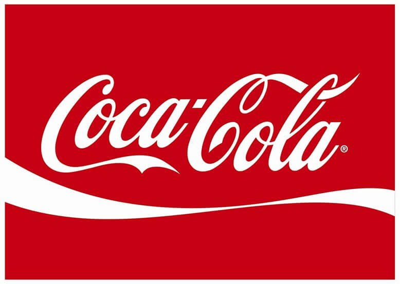
Coca-Cola is a brand that is instantly recognizable thanks in part to its distinctive typography. The brand's script font has remained largely unchanged since it was first used in 1887 with mostly just refinements along the way. It has become synonymous with the brand's values of happiness and positivity. Most importantly Coca-Cola uses this typography consistently across all touchpoints, from packaging to advertising, reinforcing the brand's identity and connection with consumers. Nowadays because of Coke's massive industry-wide reach, you often can't even go a day without seeing their iconic and luxurious font somewhere.
LOS ANGELES DODGERS


The LA Dodgers are another organization that has successfully captured the use of typography to create a strong connection not only with their fans, but with individuals who come across their "street-style" font in general. The team's custom typography and the iconic "Dodger Blue" color scheme are instantly recognizable symbols of the team's history and legacy. The typography is prominently featured on team merchandise, stadium signage, and social media channels, reinforcing the team's identity and connection with its fans. Often times today, you may see stacked letters like the "LA" that the dodgers so heavily rep, it's not unlikely that the influence travels far from the source, for anyone that sees that style is instantly reminded of the "dodger blue" legacy.
NIKE


There's no debate that Nike is an absolute powerhouse of an organization. Known for incredible sportswear apparel with unique designs and abstract form, yet they use a simple bold, sans-serif typography to represent the brand. The contrast of the simple branding with exquisite designs showcases a near perfect marketing structure. The typography is a nod to the brand's focus on performance and innovation, and is used consistently across all of its touchpoints. It's almost instantly recognizable, and it has become a key part of the brand's identity and recognition over the years.
APPLE


Apple, another industry leading company, perhaps most familiar out of this list to consumers worldwide, has possibly implemented the simplest use of typography yet. The company's clean, minimalist typography reflects the brand's commitment to simplicity and user experience, after all their devices are largely popular for their reasons of user ease and satisfying layout structure. Their typography is used consistently across all of the brand's touchpoints, reinforcing its identity and recognition. When it comes to success, theirs few that reach the prestige that Apple has, they are a marketing and branding workhorse and it doesn't stop at just the typography. In later blog posts we may reference apple in its entirety, to show how crazy their branding journey has been.
In conclusion,
Typography is quite a powerful tool that can significantly impact a brand's identity and recognition. Brands like the ones mentioned above have successfully used typography to differentiate themselves and create a strong connection with their customers. By considering factors such as legibility, scalability, and consistency, brands can effectively use typography to convey their values and personality, ultimately helping them stand out in a crowded market. Take this into consideration when creating logos, building brands, or strategizing for a design strategy. Whether it's for yourself, or work you're doing for others, knowing the importance of typography can really set you apart from other designers.

